
This brief was set by Fedrigoni x Oliver Bonas, to create the packaging for a new range of four candles for Oliver Bonas SS20 collection, using Fedrigoni Woodstock paper range.
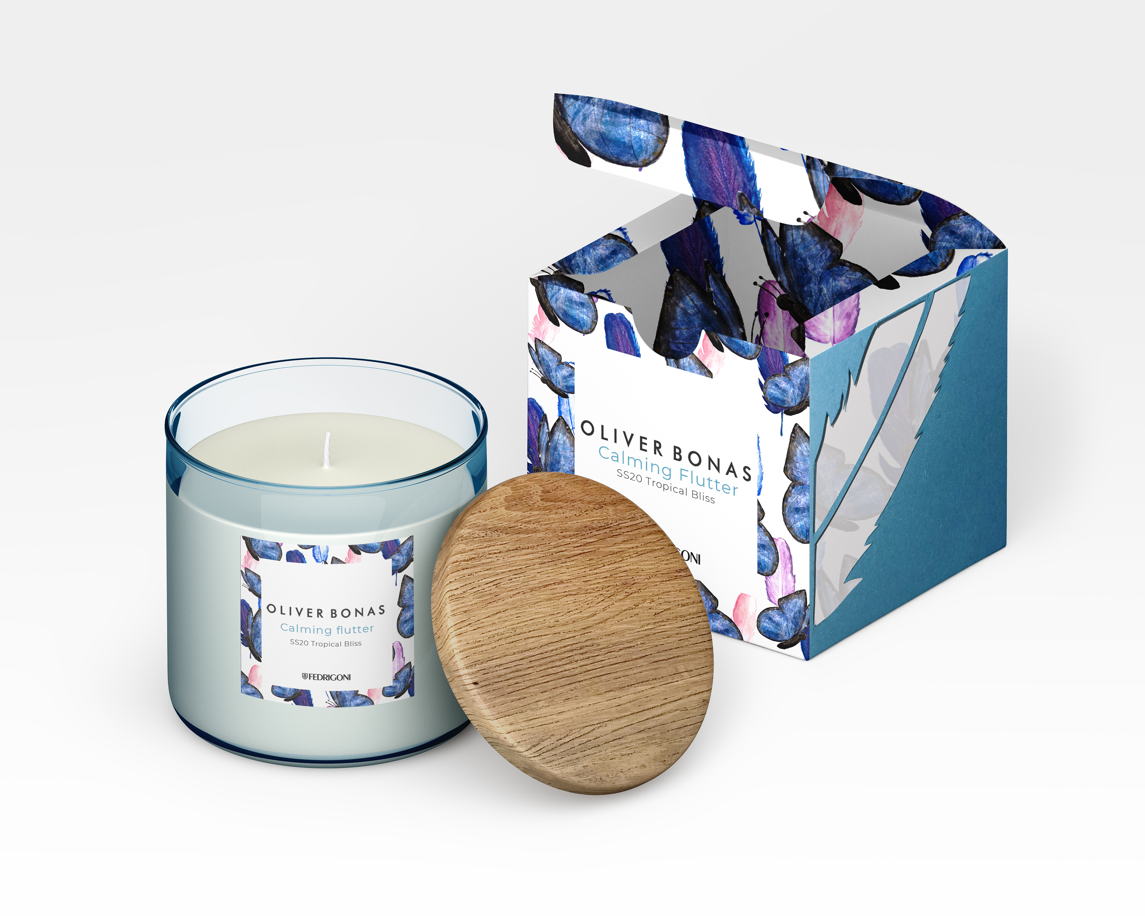
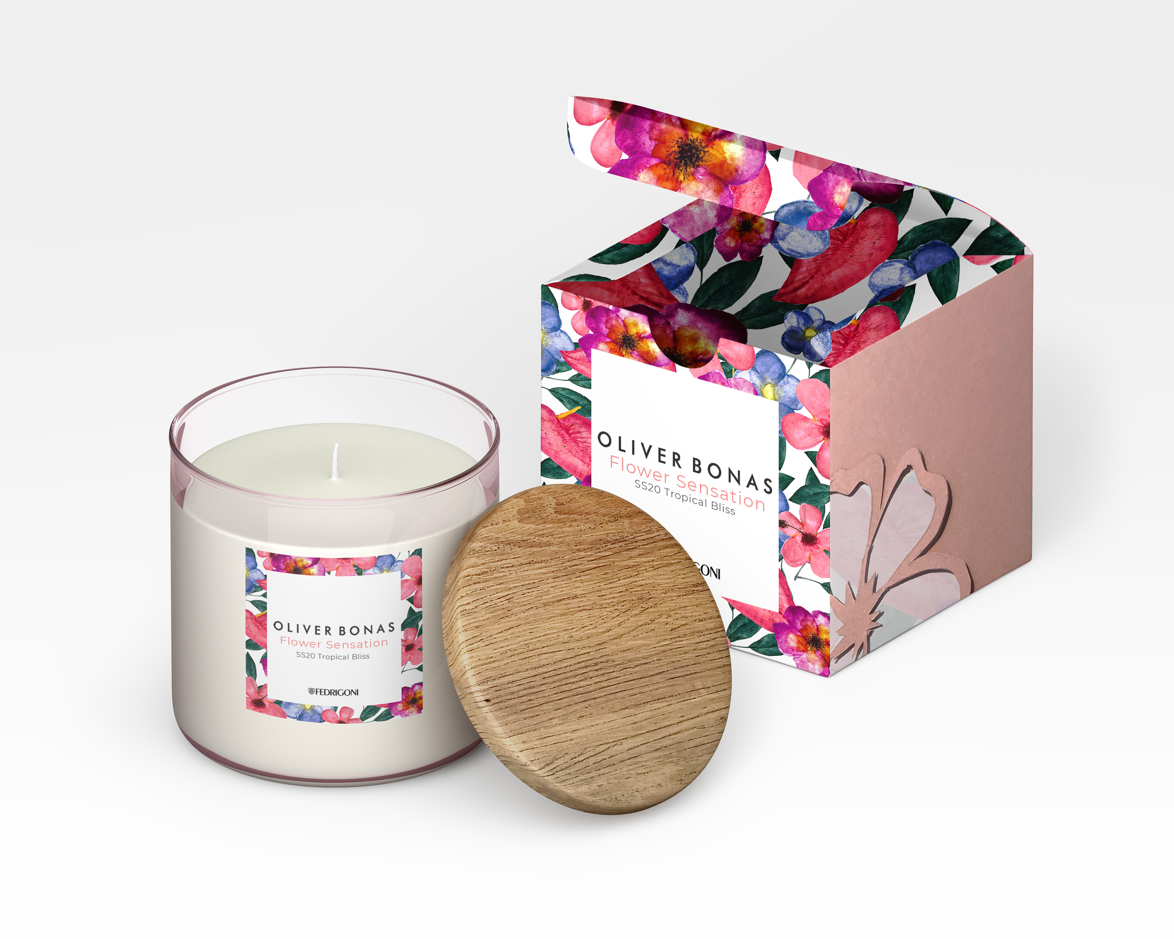
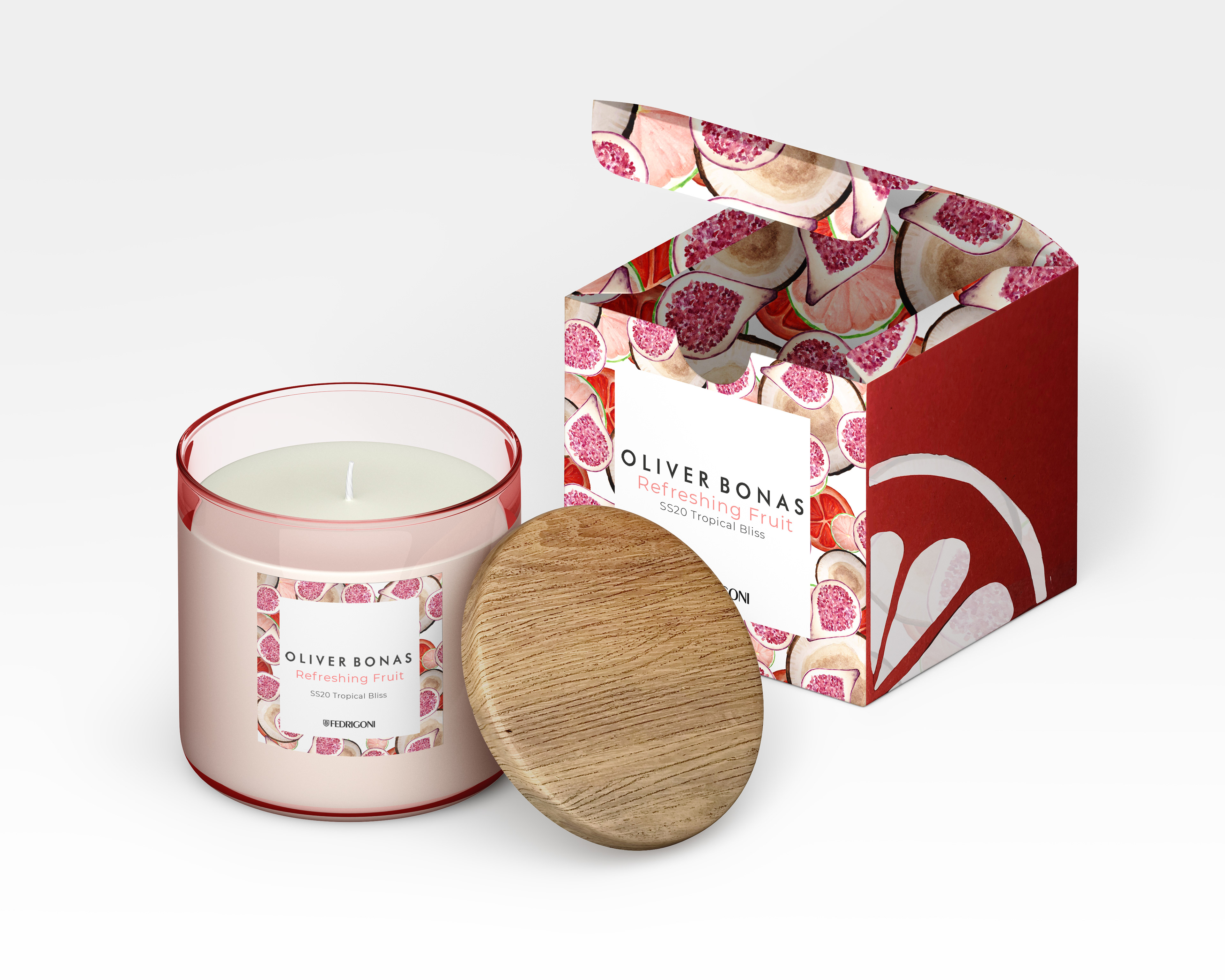
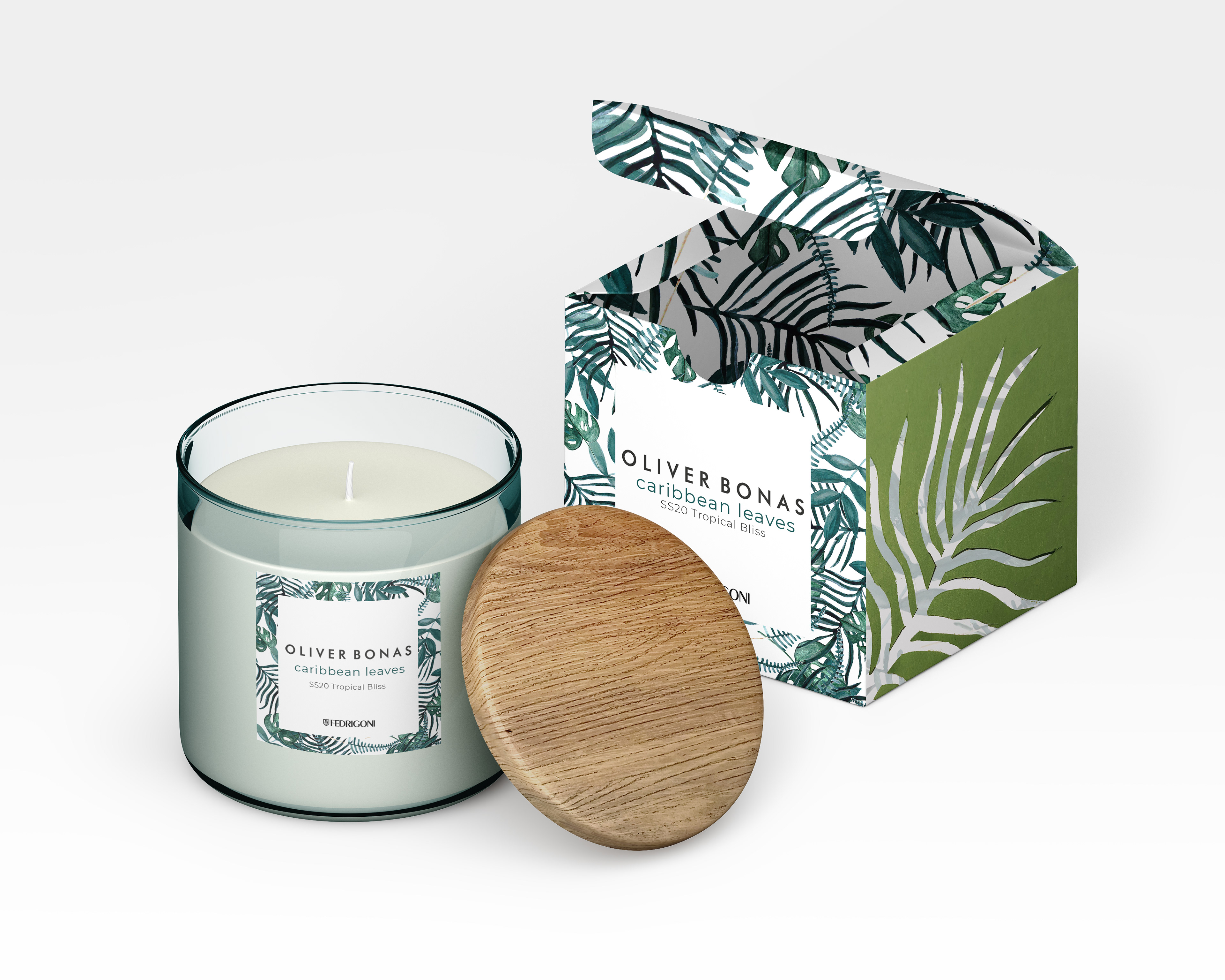
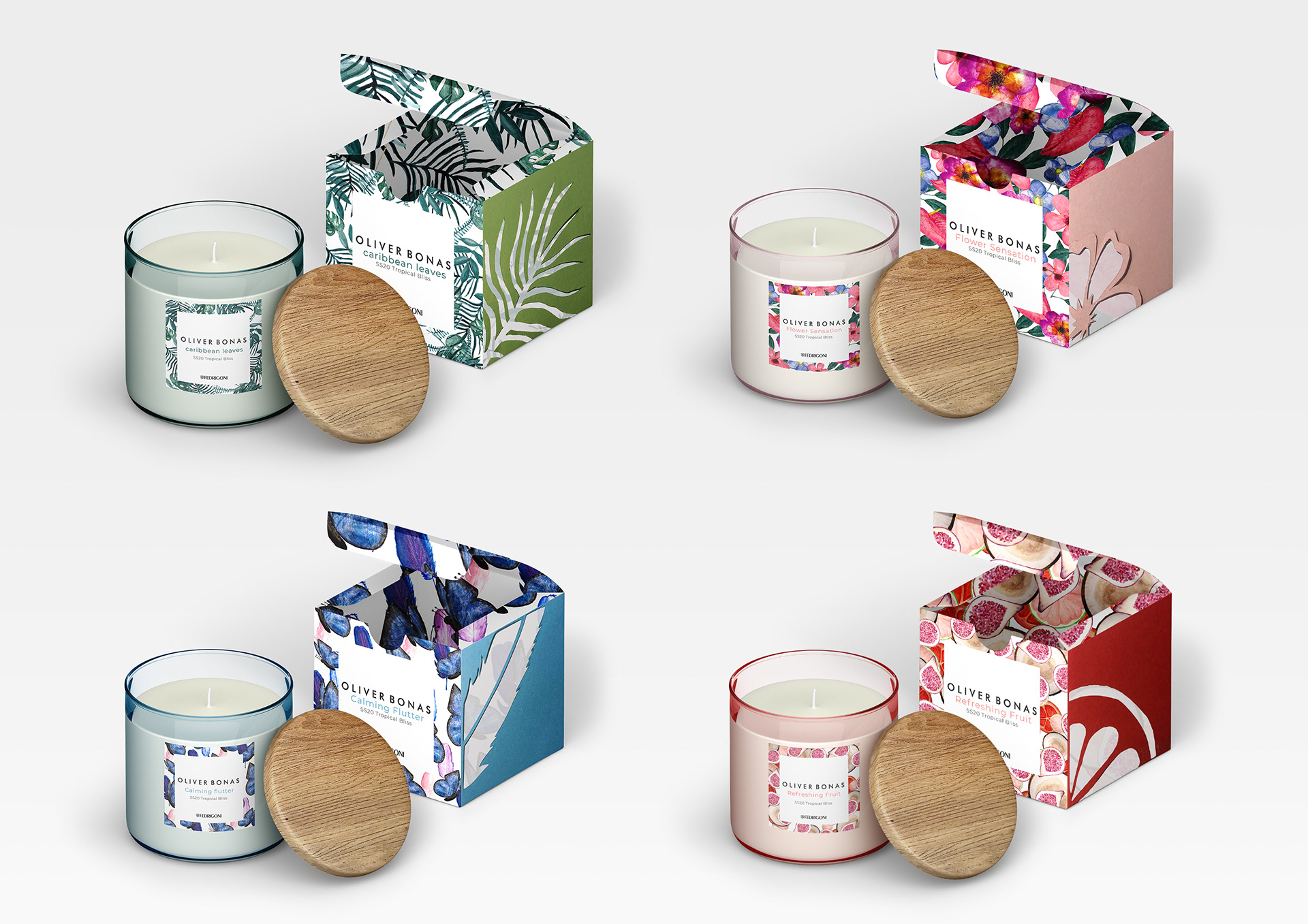
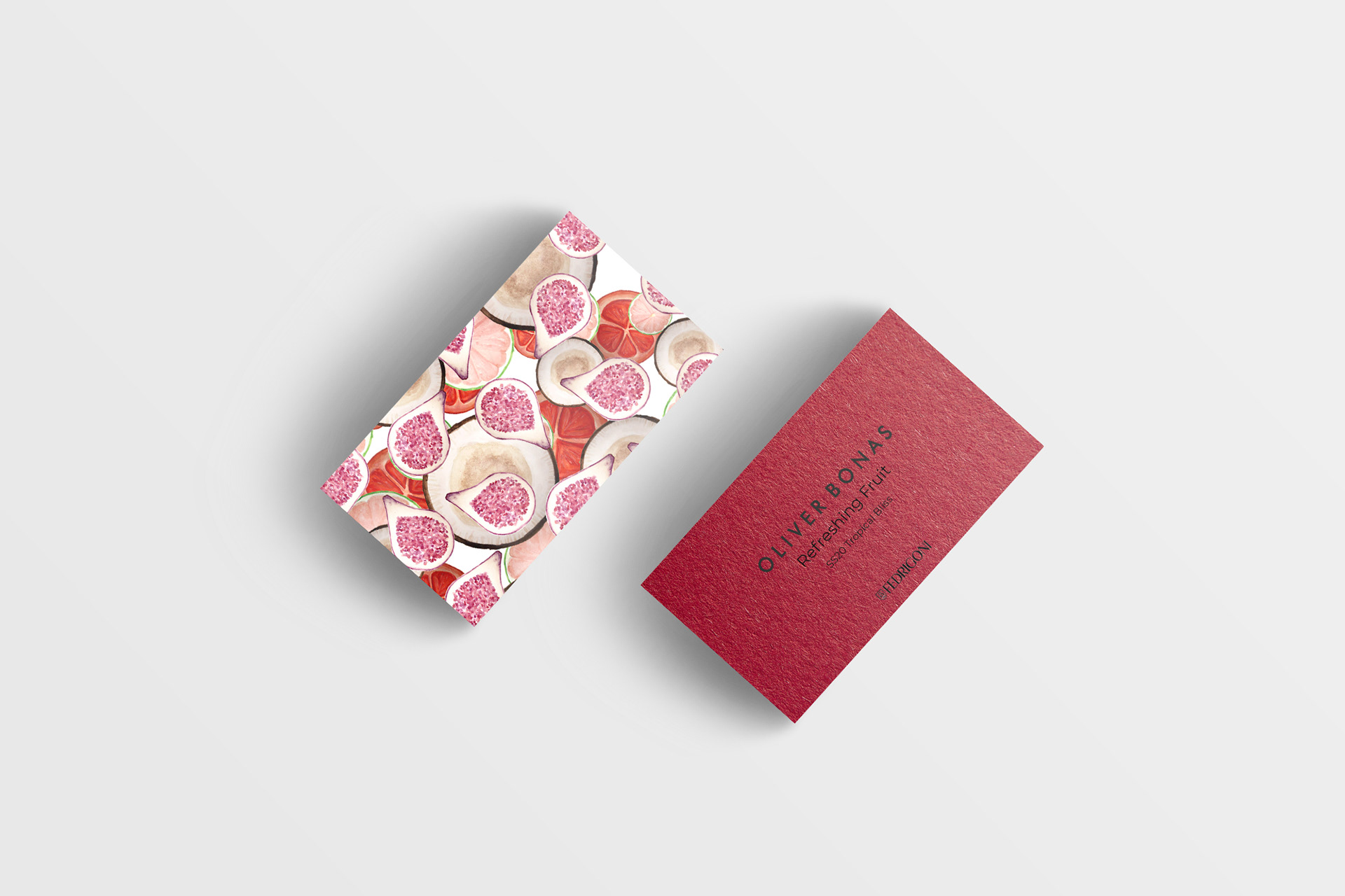
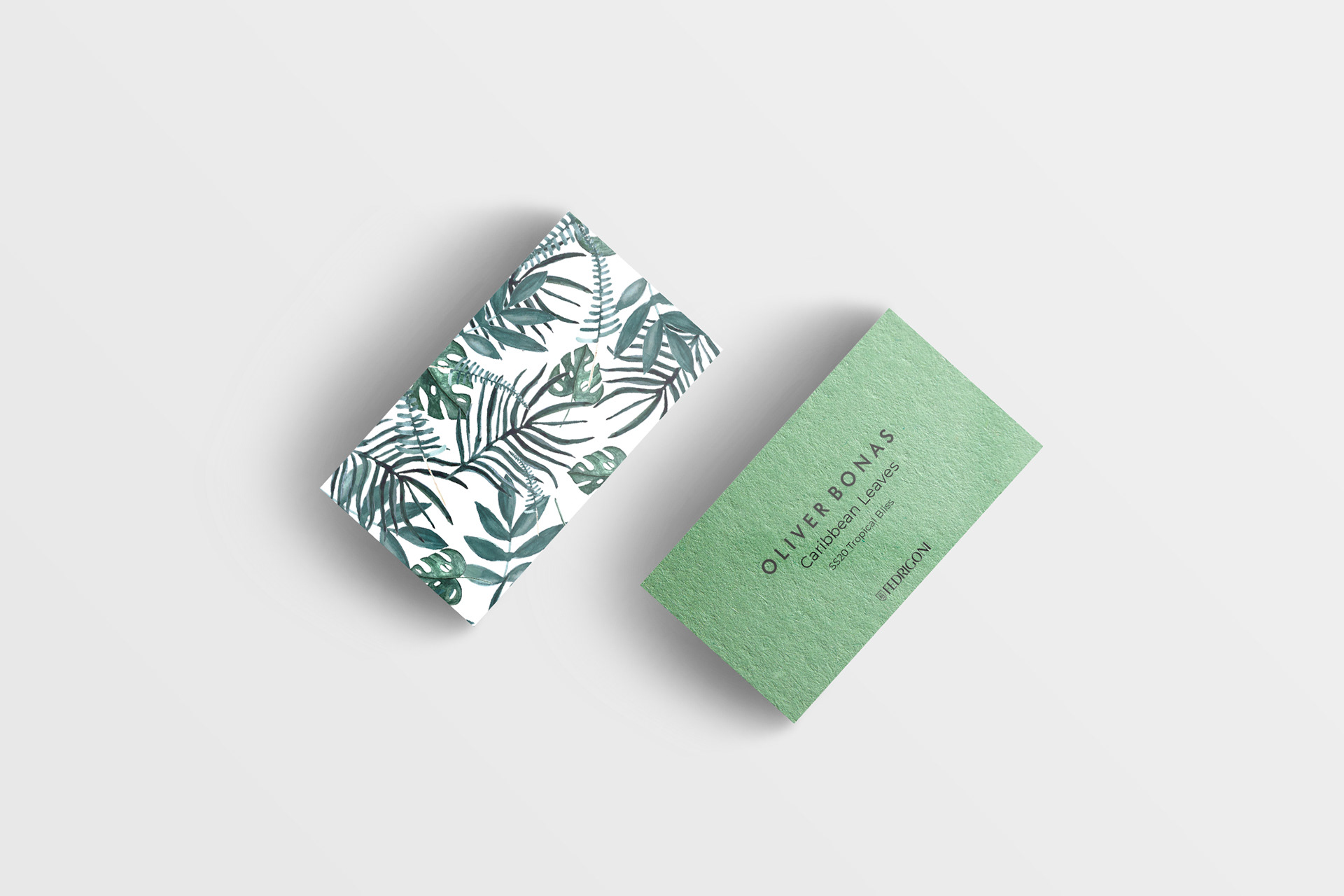
I chose to look into different tropical elements as the main theme for my range. I felt this was well suited to the season of the range with it being a popular holiday destination to a tropical country. The concept behind the range is for each candle to show a different tropical element as a pattern.
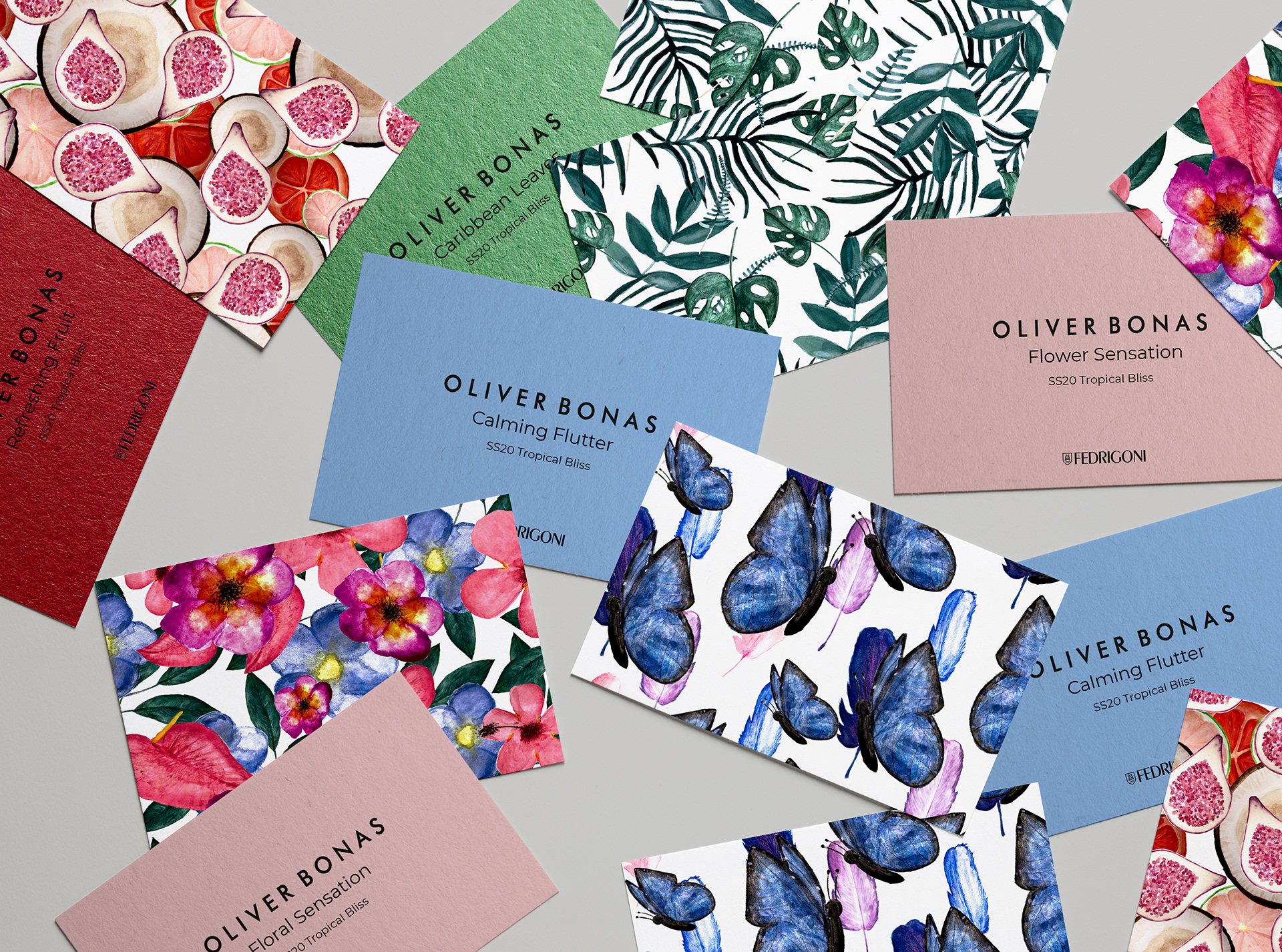
I researched and looked into four different tropical elements: leaves, flowers, animals and fruit. With wanting to create tropical patterns for the packaging, it was important to include accurate tropical elements and, to look into the different types or different species of each four elements. All four tropical elements had a very unique look and feel to them, so it was important for me to carry that out in my design.
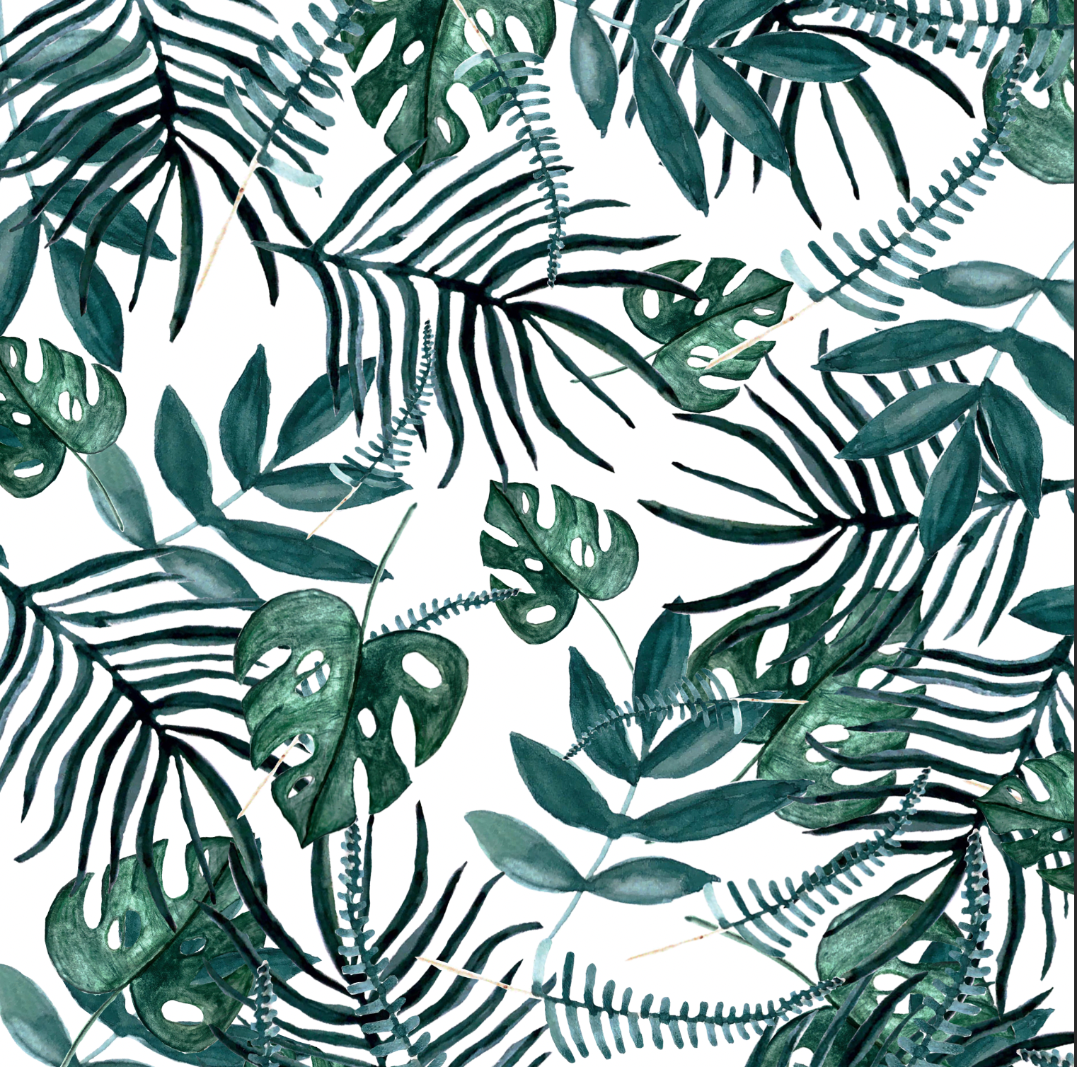
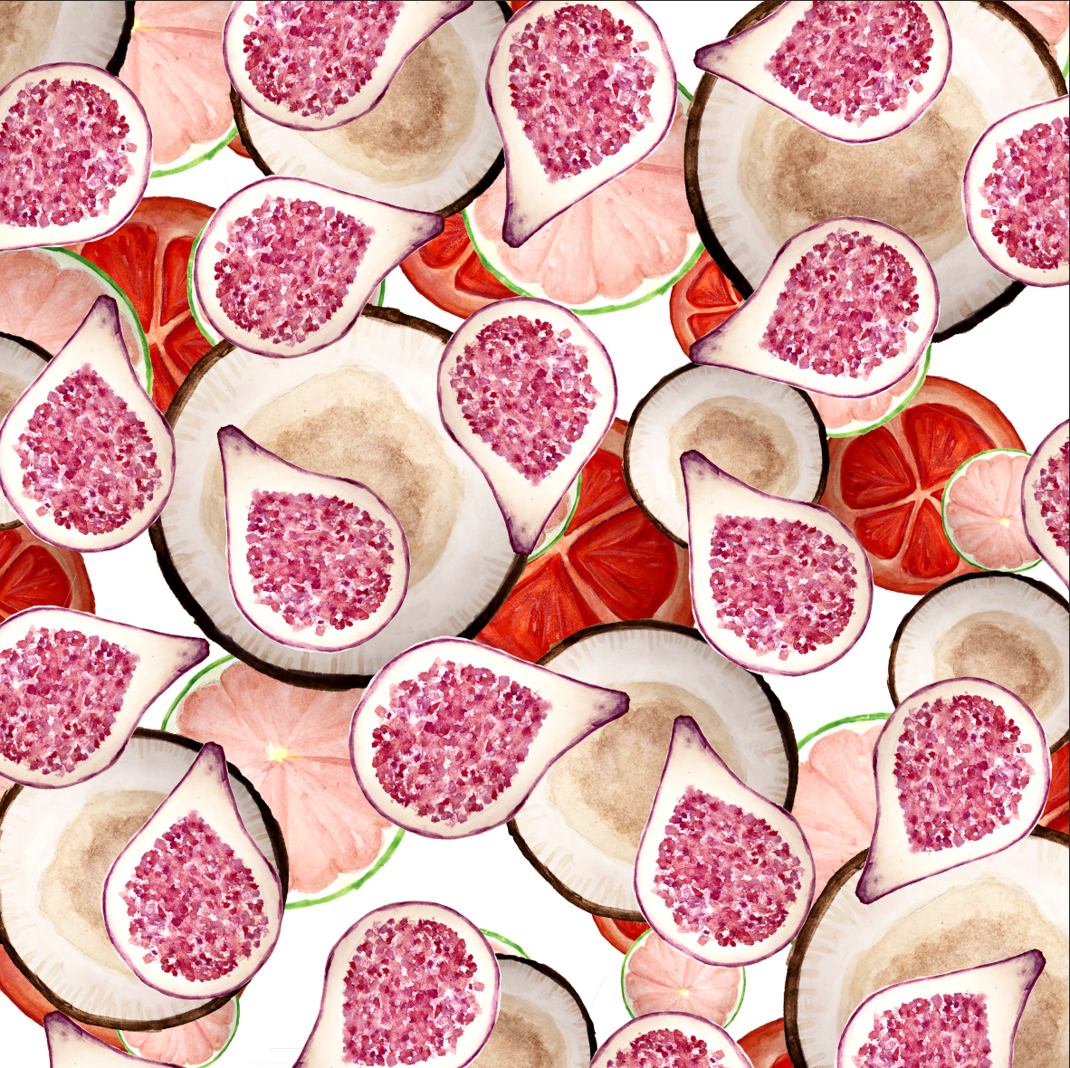
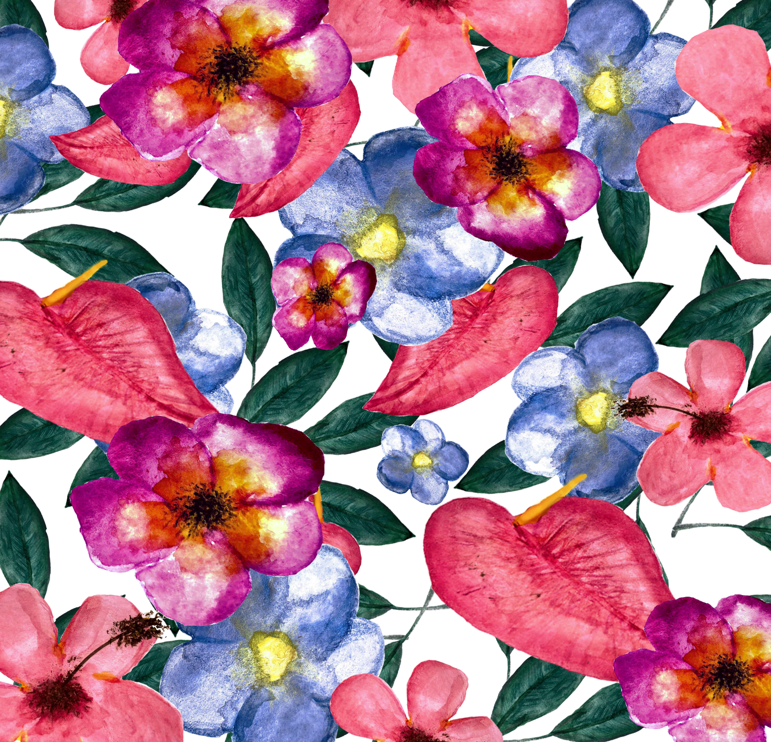
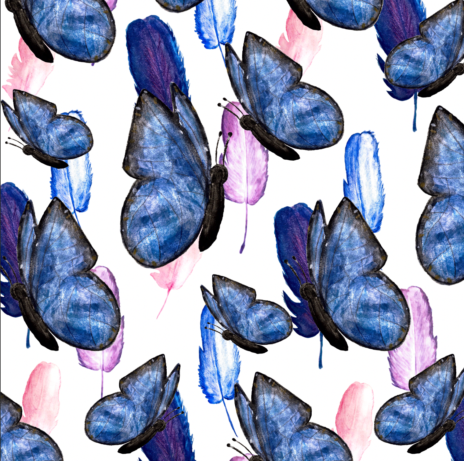
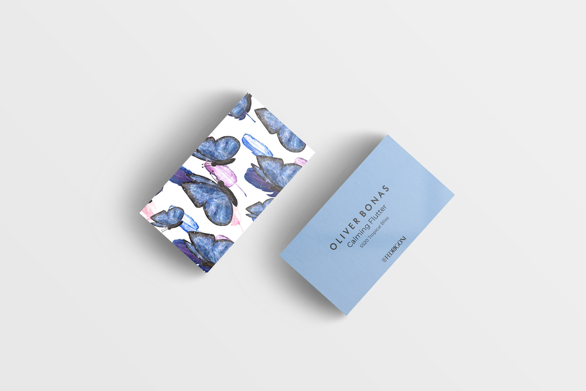
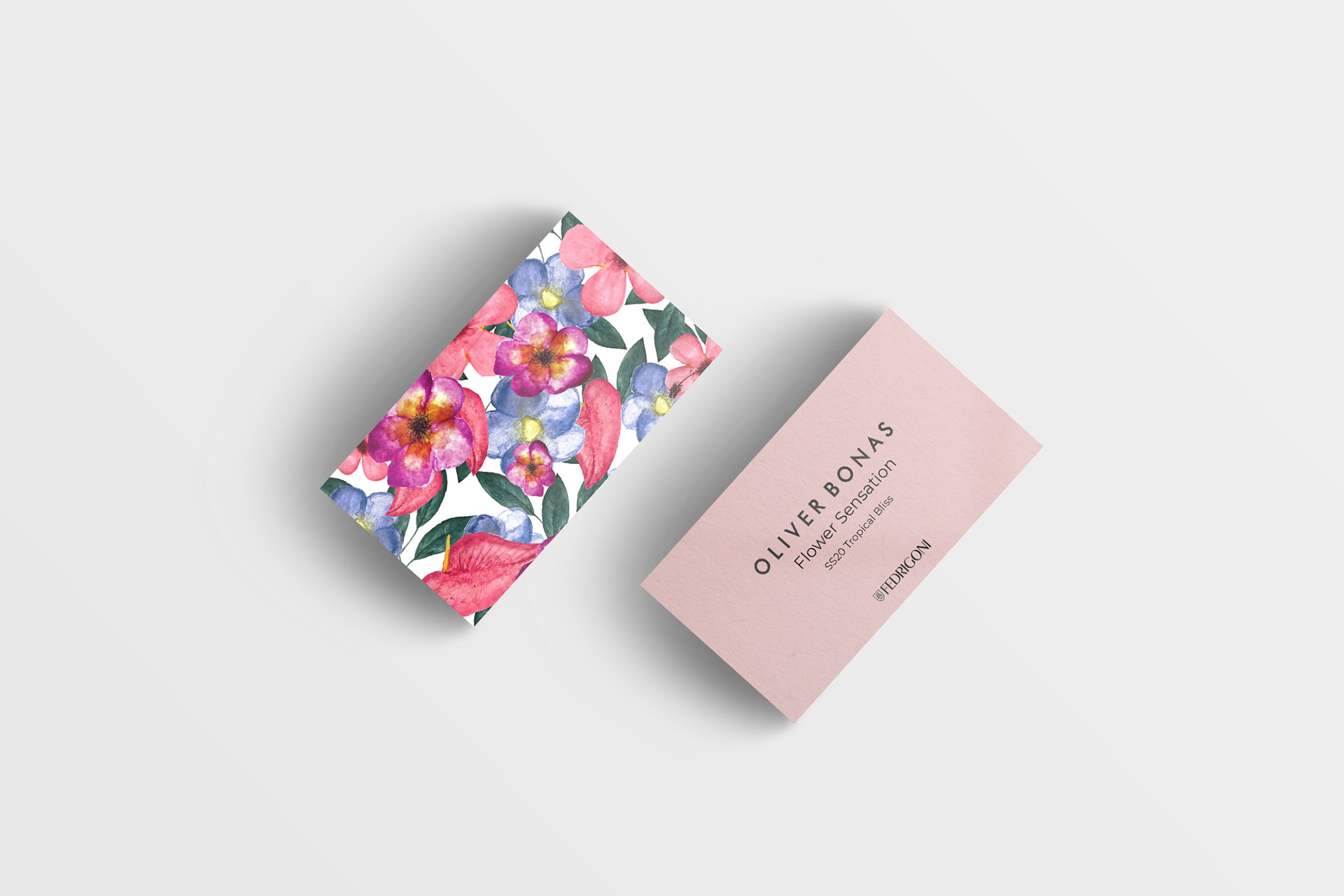
I made watercolour illustrations from how Oliver Bonas has an authentic feel to their products with them looking handmade, which I felt using this medium would portray this. Using watercolour did add a handmade feel to them, that showed detail and texture to each illustration, that wouldn’t have had been achieved digitally.
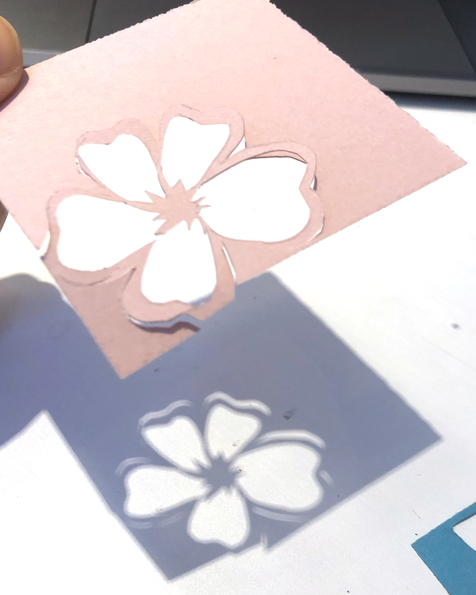
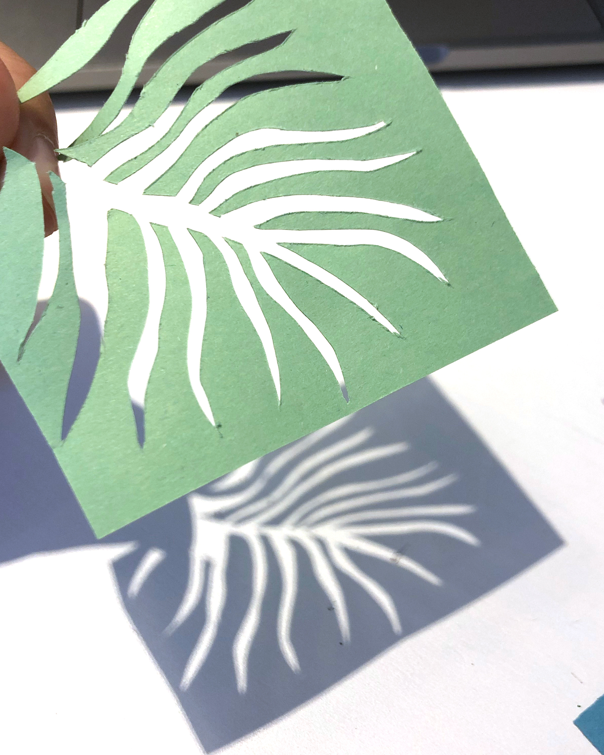
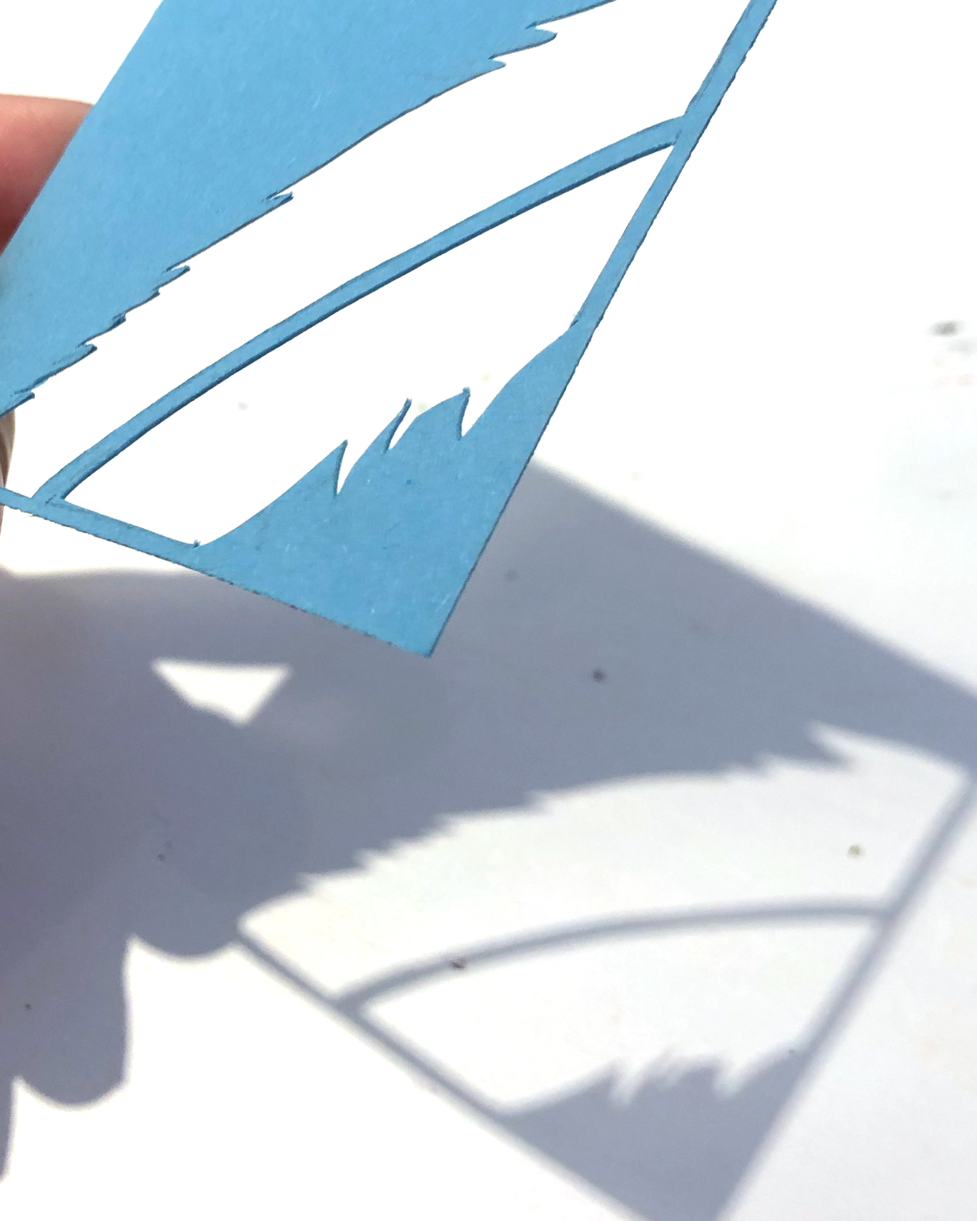
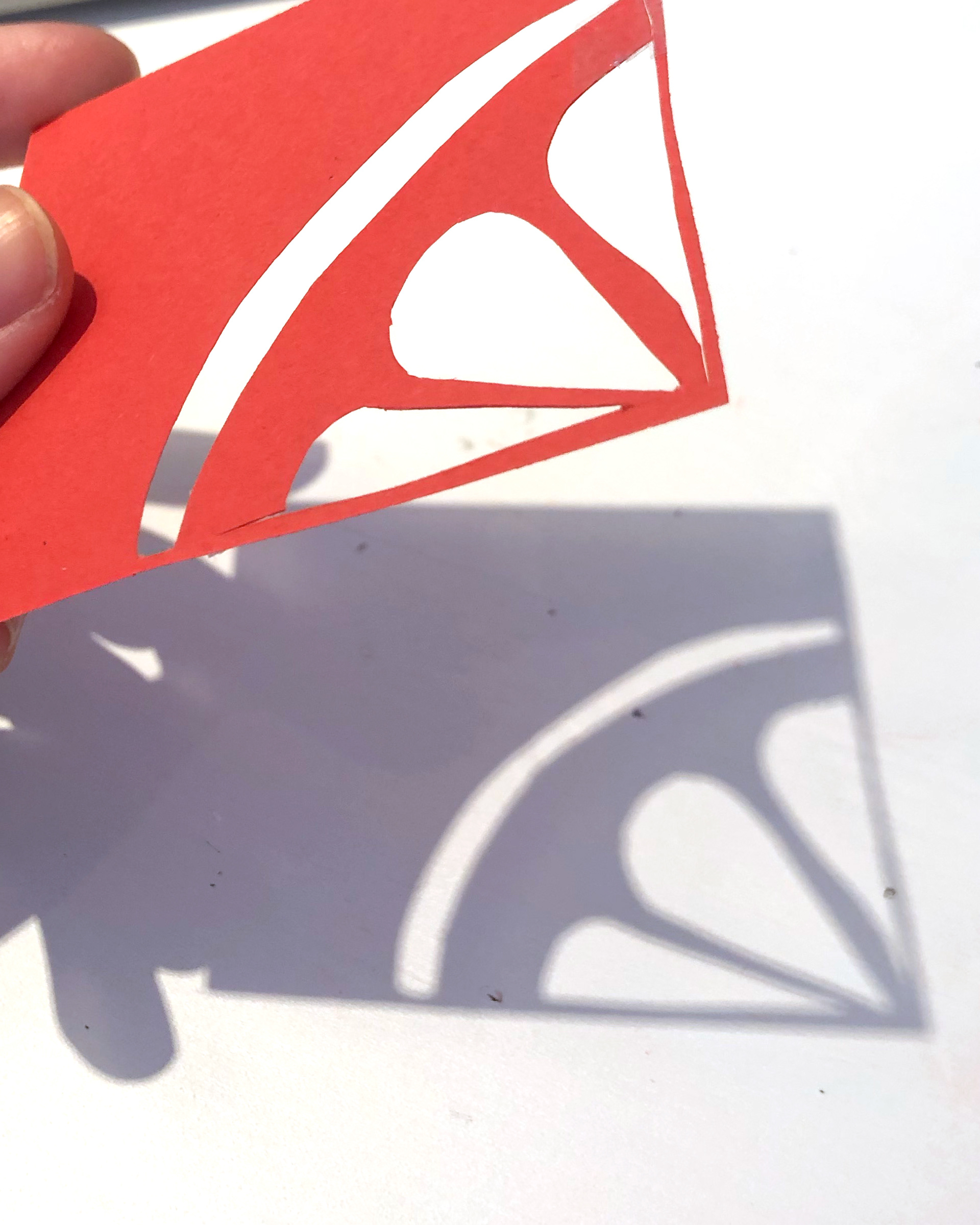
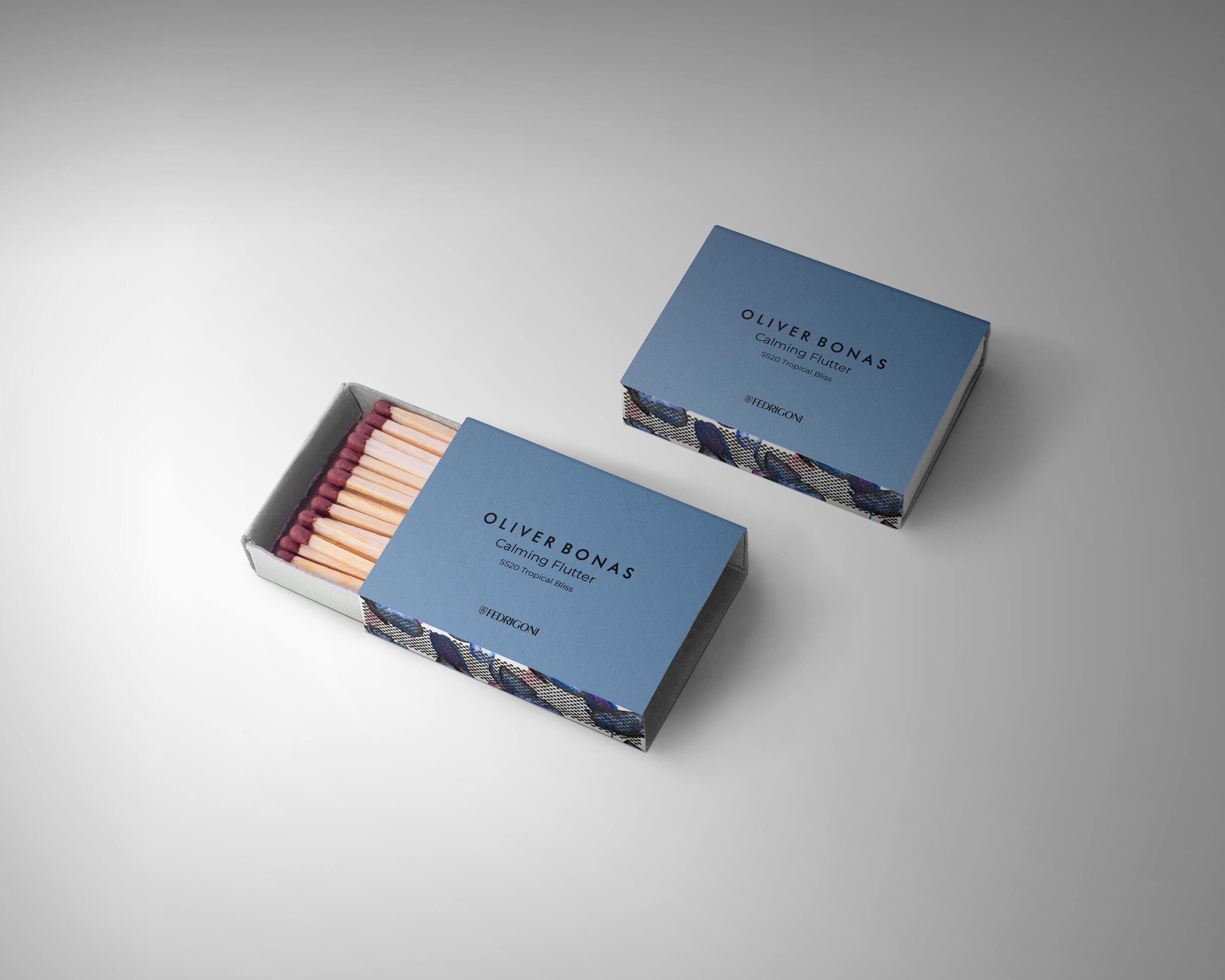
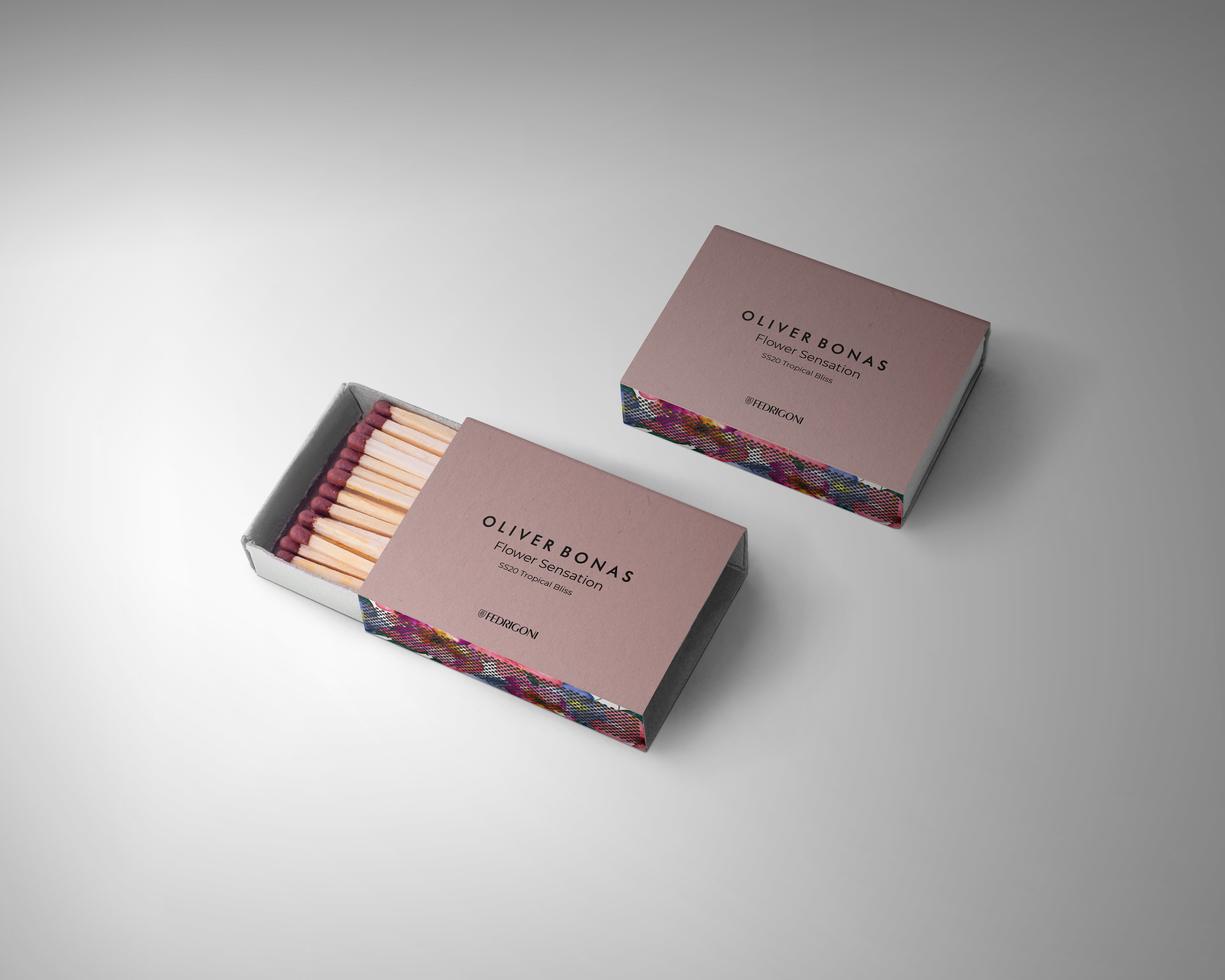
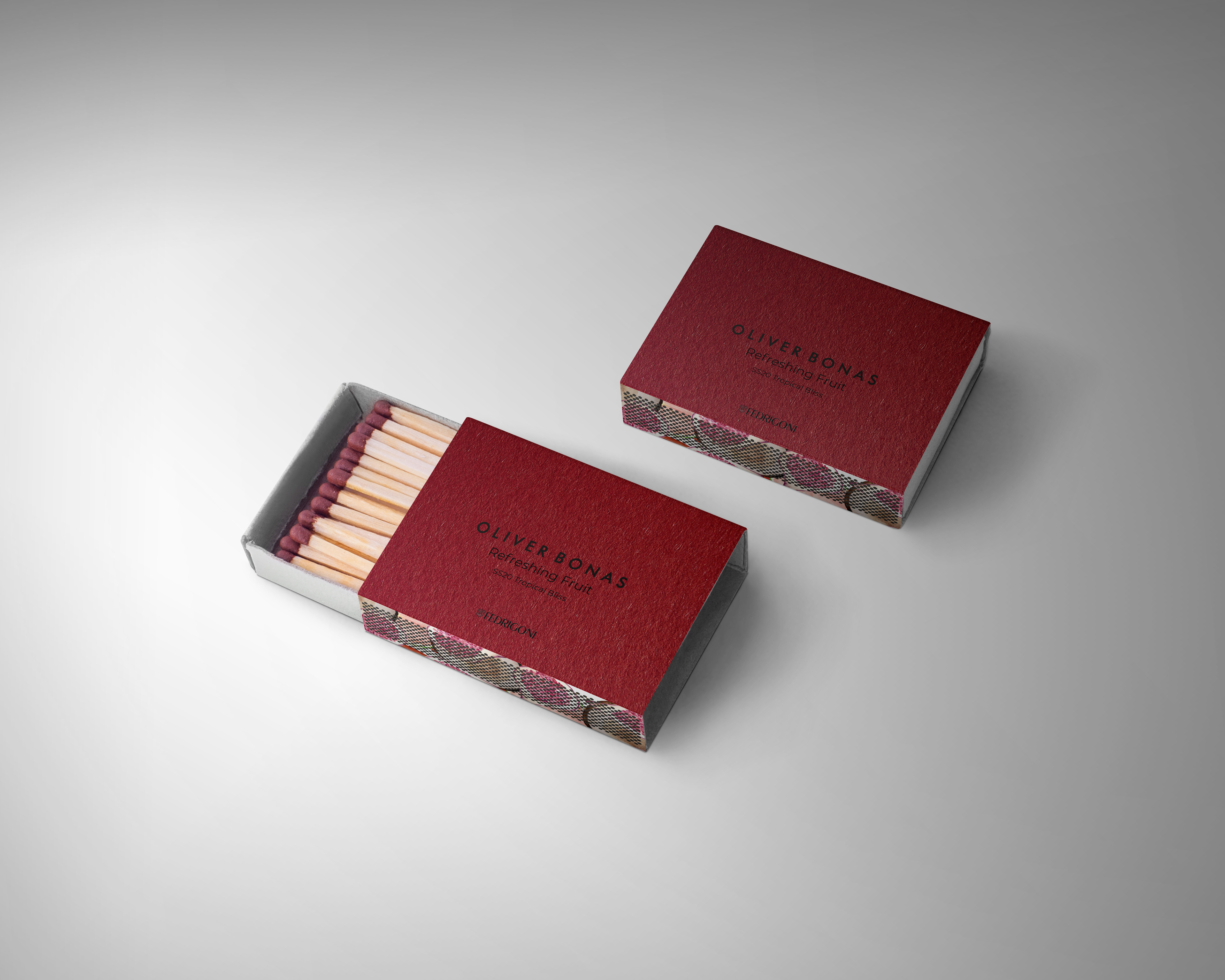
I chose the paper Verde, Cipria, Azzuro and Ross from the Woodstock range as I felt it complimented each induvial pattern colour, which would go well together. I used the paper in my packaging by cutting out a leaf, fruit, feather and flower to go with the packaging. Having the cut-outs on its own created a stunning shadow of each element as well as it being a sneak peek inside each candle packaging.
I named the range ‘Tropical Bliss’ as I wanted the word tropical in the name from it being my main theme for the candle range. I chose the word bliss for the definition, ‘perfect happiness and great joy’, which is the right representation for the candle range. The patterns being inside of the packaging box, so when you open it, the pattern reveals the scent of each individual candle. The range creates a fun, warming, authentic and joyful candle range showing different tropical elements. Each candle design represents the feeling or smell of each candle scent from Caribbean leaves, to a floral scent called ‘flower sensation’, to a soft, relaxing scent called ‘calming flutter’ and then to a juicy scent called ‘refreshing fruit’.
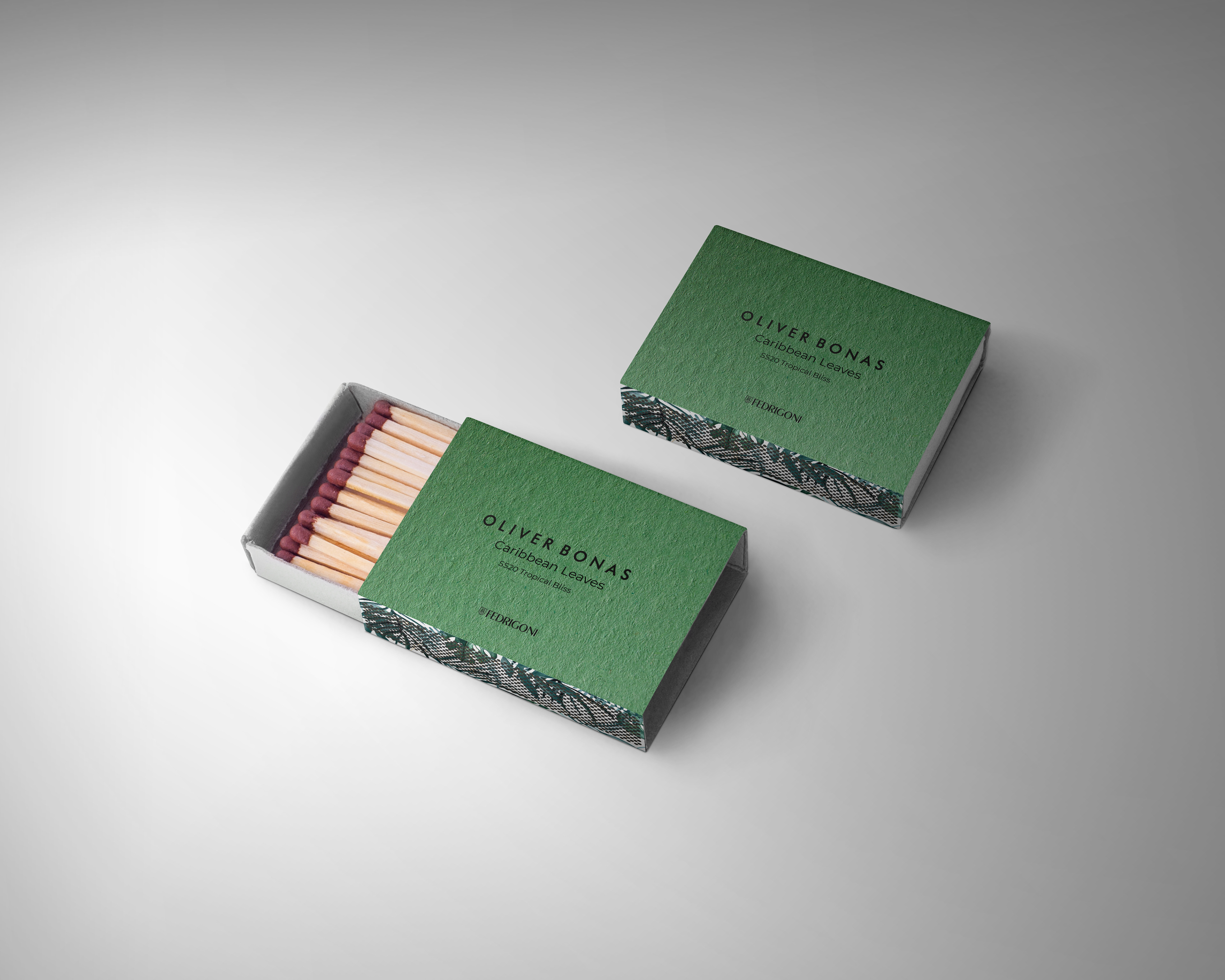
For the range, I wanted scented cards with the patterns and Woodstock paper on it, so a customer can smell the candle and get a feel to it. I also created some matchboxes with the patterns and Woodstock paper as another element to go with the range so you can purchase a matching matchbox to your candle and light up your candle.
The illustrations I made help bring this candle range together, with the perfect combination of the Woodstock Fedrigoni paper. The range has an authentic look, from the watercolour illustrations and the cut-outs of the paper, which complements each other. I feel this range is perfect for a SS20 collection from the packaging being bold, fresh and exciting. The delicacy of the packaging makes you want to keep it as a collective, with also creating scent cards and matchboxes, help gives this range a clear identity and stands out. I am overall very pleased with how my candle range ‘Tropical Bliss’ has turnout.
Professional Practice - Live Design Briefs - 2020