
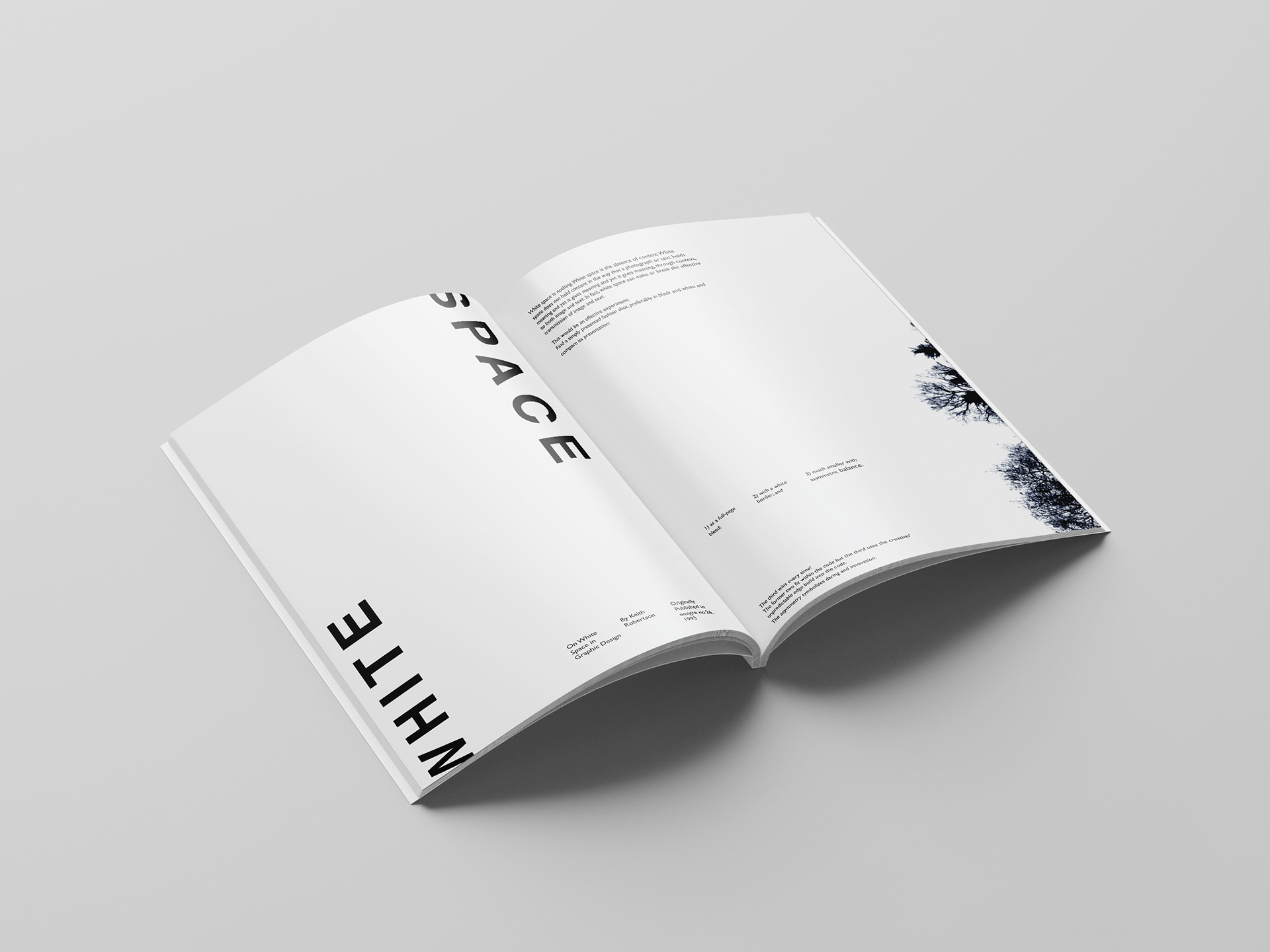
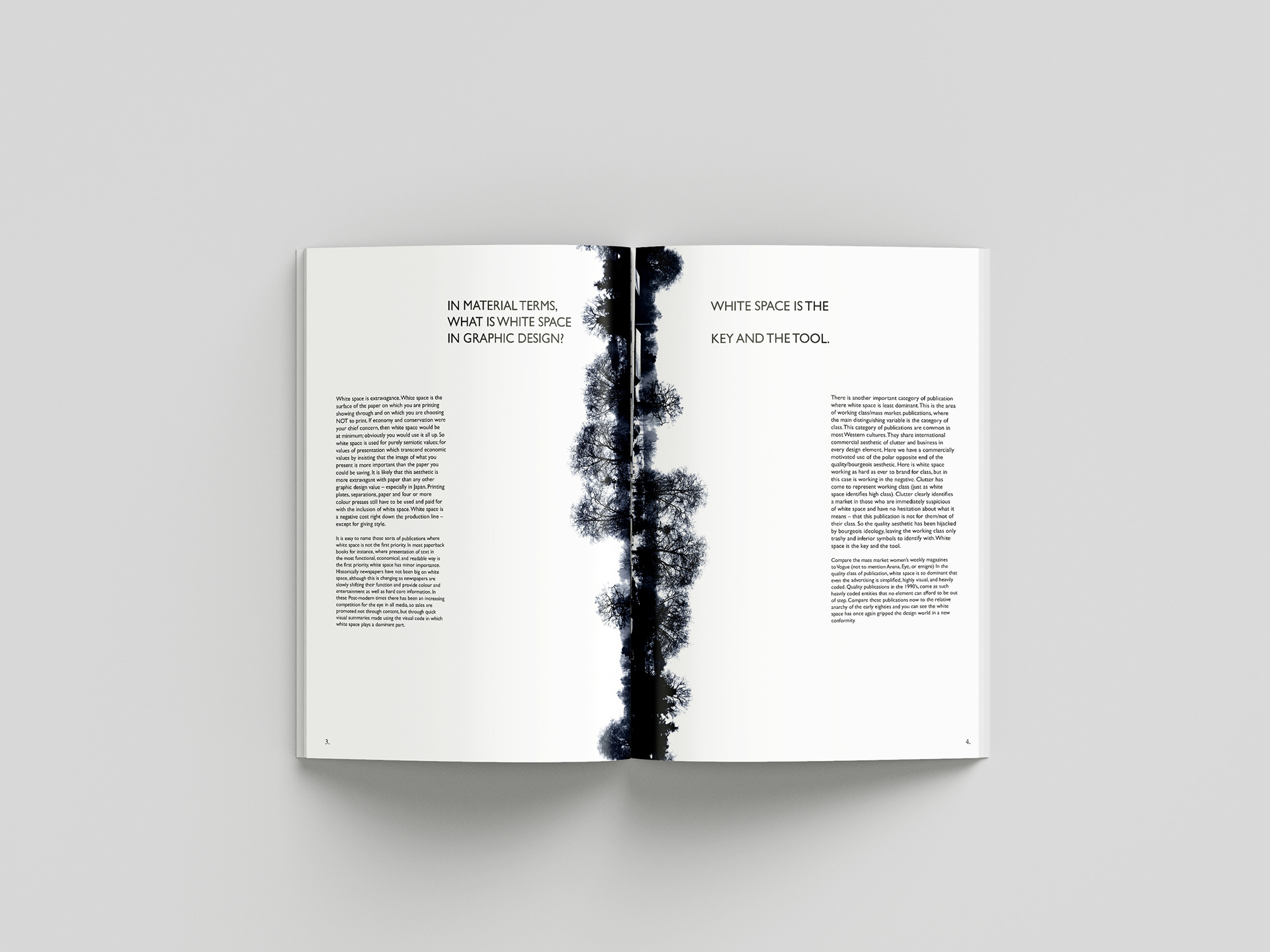
For a university module on the fundaments of graphic design, I produced a magazine spread on the text "On White Space in Graphic Design" by Keith Robertson. The text is about white space and how it is used and applied successfully in graphic design.
I wanted to explore this theme through the use of imagery to focus on the white space of the text and the images used. I explored several themes and ideas in my development, which I went with these landscape shots of trees in the snow for the imagery, that worked perfectly to reflect the text on White Space. I kept to a minimalistic aesthetic to also help achieve the white space of the design, sticking to a san serifs font.
Fundamentals of Design Practice - 2018