This was a group-based university module on Identity and Branding. The brief was to design and produce a complete visual identity that expertly captures and communicates a theme and purpose for a pop-up show. We had to also apply our identity professionally across a range of beautifully designed promotional outputs which will include print design, digital content, and environmental graphics.
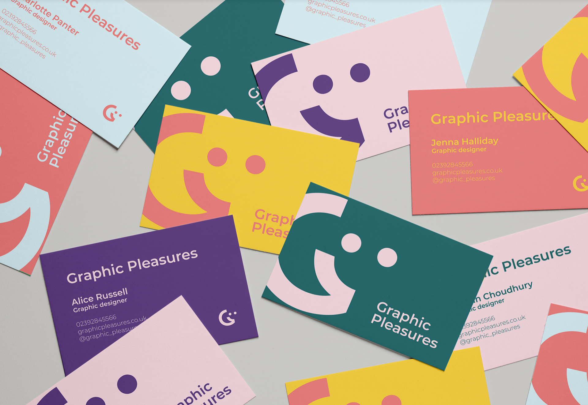
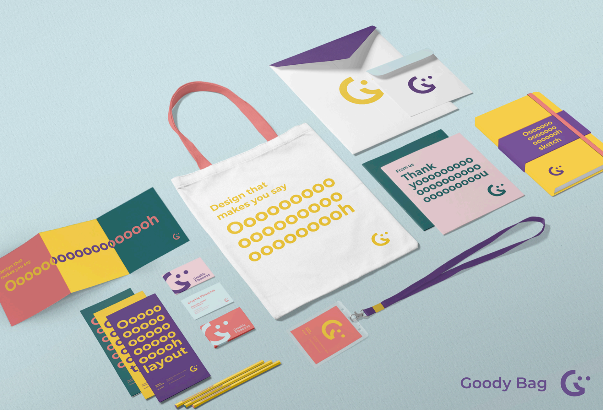
In the early stages of ideation for our identity, we came up as a collective that we were passionate, obsess, geeky and enjoy design. The aim of the show would be to explore our passion and the different sensory elements of Graphic Design, where it would celebrate the simple pleasures found within Graphic Design. Our aim was to give an insight into Graphic Design, to those who would not know much about it, with portraying our identity as passionate and geeky. Our branding name we came up with to show this, Graphic Pleasures.
The concept behind the logo is the ‘G’ from Graphic design and the smile to represent pleasures. Good design makes an audience subconsciously say ‘oooh’. We want our copy text to reflect this through our branding. We needed a timeless, sans serif typeface, so that our branding in and out of our exhibition would have a strong readability, whilst allowing us to be playful with the various styles that it comes in. For our identity, we wanted an exciting colour palette that was vibrant yet harmonious and coherent when used together or separately.
Professional Practice - Identity And Branding - 2020