For my Major Project I chose to look at the subject of Beauty Standards. I am intrigued by the concept of beauty and wanted to investigate this topic with a focus on the effect the beauty industry has on our expectations. During my research, I found many themes/subjects that interested me. The obsession of wanting to look beautiful and/or presentable is something of great importance for many people, with some individuals going to accomplish their accepted beauty ideal. Further research revealed, plastic surgery as an example of the extreme measures some people may utilise to feel presentable. I found it interesting that as much as we may not like to admit it, societal pressure has increased how we tend to notice someone’s appearance and make a judgement on it. Beauty is a delicate, personal matter and the media’s high expectations, which are often unrealistic, can then make people doubt their own appearance.
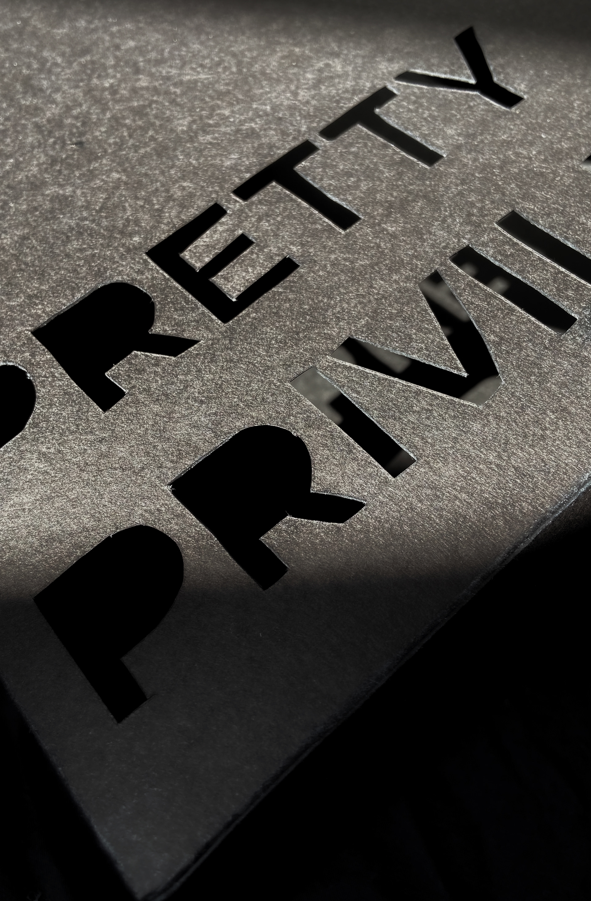
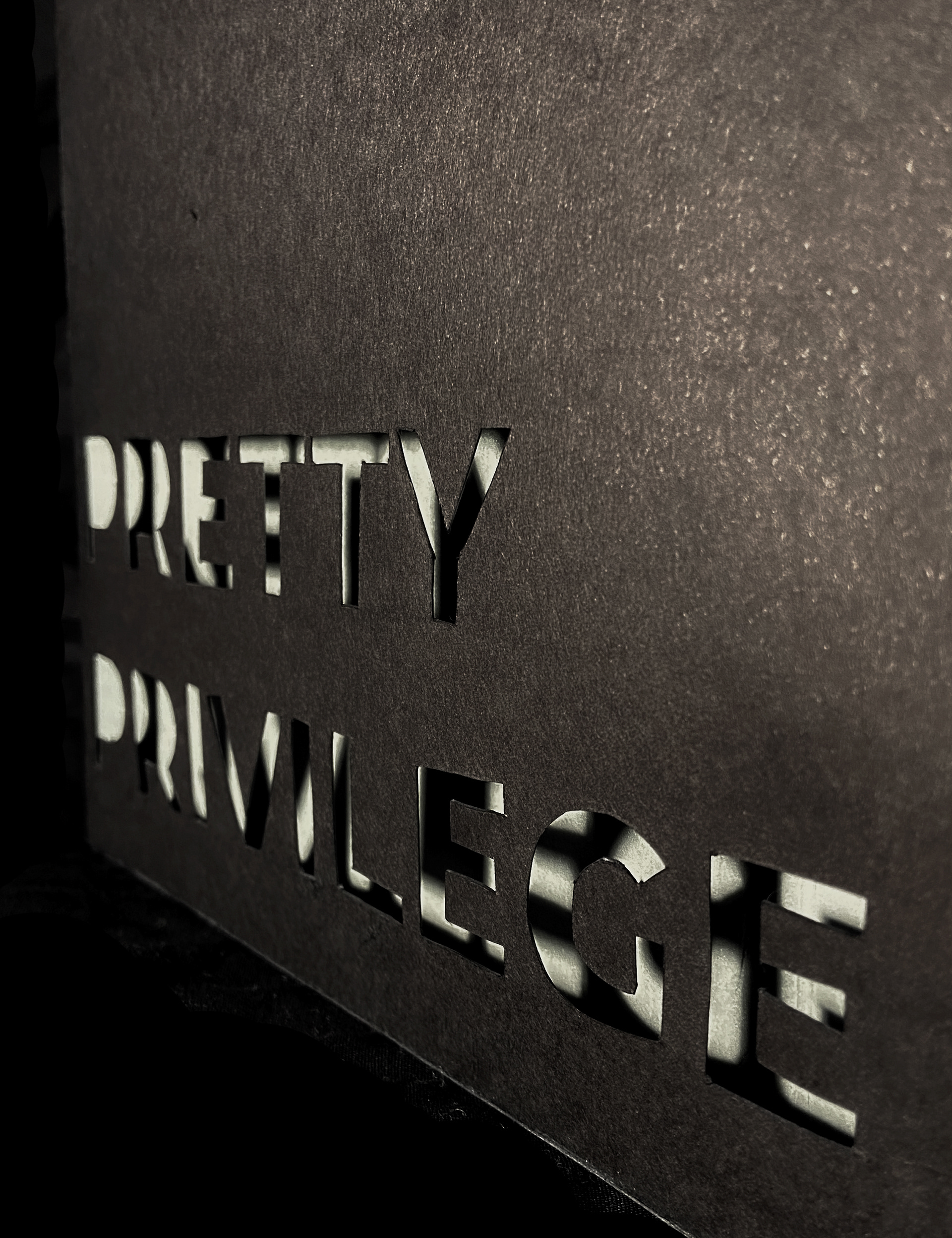
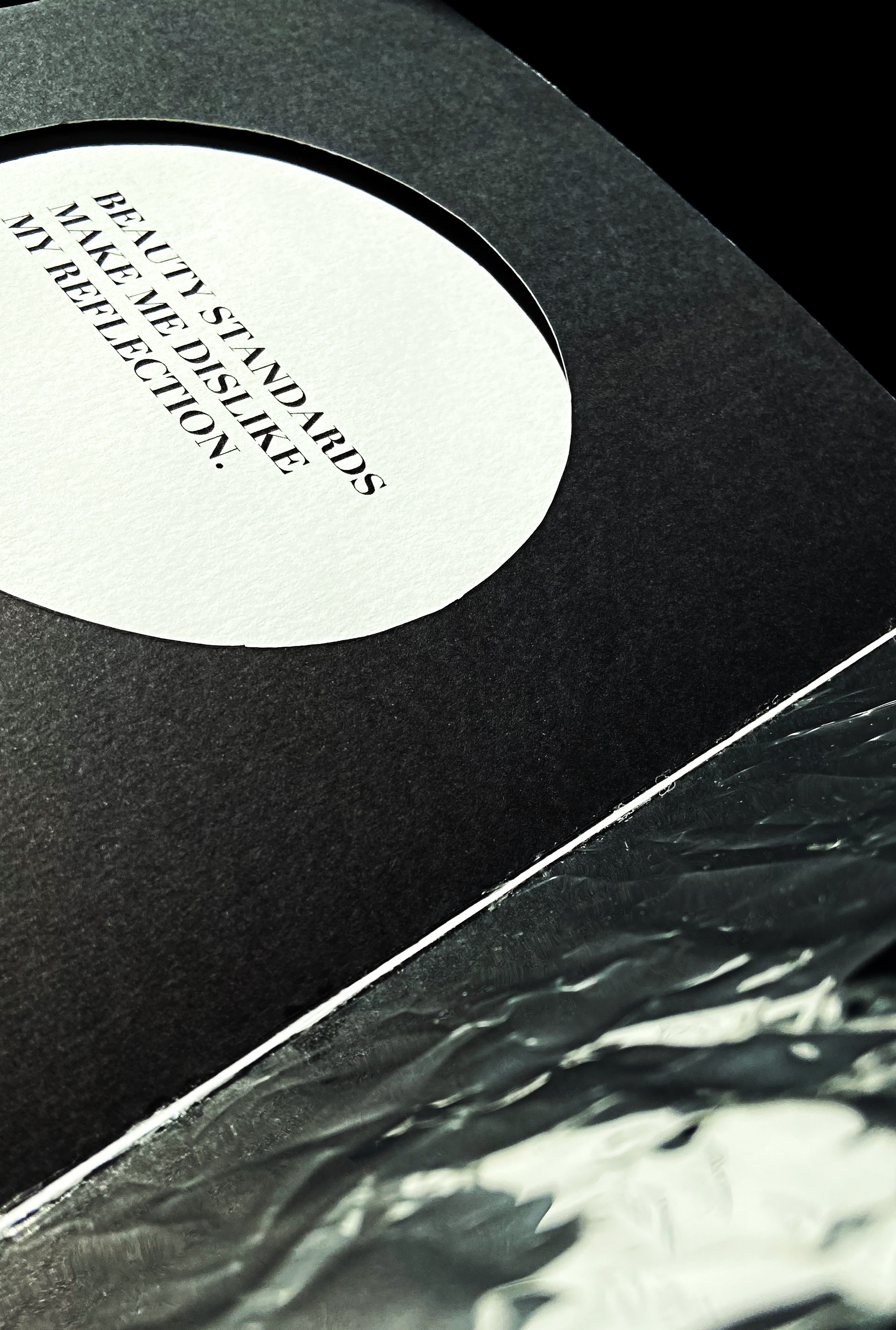
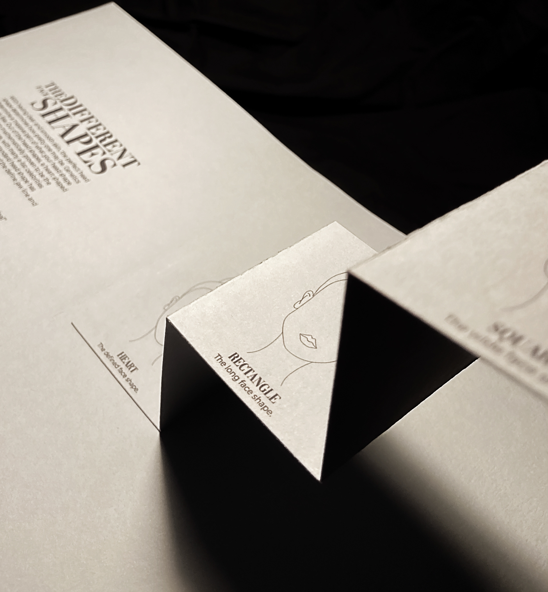
My research inspired me to create a visual representation of how beauty standards affect one another through an interactive book. I named the book “Pretty Privilege”, to indicate how beauty standards can create a hierarchy in society by defining the ‘ideal look’. The interactive element of the book was inspired by creating physical ‘visual illusion’ or visual experiments. Deciding to have my book as interactive, helped engage my target audience and took them on a journey through the book revealing how damaging beauty standards can be. I wanted my book to be a square shape, 210mm x 210mm, to replicate the square photos used on Instagram. The colour scheme I chose for my resolution was black, white and different tones of grey. This reflected the mood of the book portraying beauty standards as a disheartening subject and reflecting how the issue affects us all in different ways. I used a Serifs font called Didot, that had a similar look to beauty magazine typefaces, especially like Vogue’s typeface logo. The font was used for the headings in the book, arranged in different sizes to portray how a sleek font can look good in different sizes, and we as individuals can also do in a metaphoric way. For the cover of the book, I used a metallic silver paper to represent a mirror and introduce the actual mirrors which are used within the book. I also designed a slipcase jacket to protect the book. I hand-cut- out the title of the book, Pretty Privilege, to reveal the cover and to create a shadow silhouette look.


Major Project - Pretty Privilege 2021